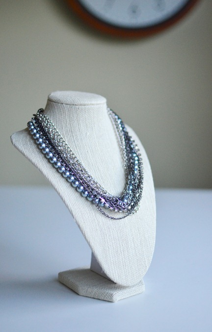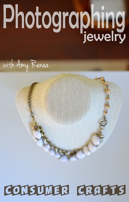
There is always 1,000 different ways to approach a still subject when photographing it. There is always room for artistic vision and switching out the norm for the fun and crazy. That doesn’t always sell though. There are tried and true layouts for editorial photos and when you stick to the formula, your photos will be accepted. Stray from the basic layouts and you’ll get more rejections, but have a lot more fun! Your choice! That first photo up there is a classic straight on shot, with the subject in the upper left quadrant, allowing room for copy. Say WHAT?
Think about it this way. When you look at a magazine cover, there is always one main subject or subject grouping. You know what? Go get a magazine. Any magazine. I’ll wait for you. Go get it.
OK – get a Sharpie and draw two vertical lines and two horizontal lines across the page, dividing it into nine parts (like tic-tac-toe). See the four spots where the lines meet? Those are the four quadrants and I bet you 3 out of 4 times the main subject of your magazine cover hits one of those cross points.
So that is the quadrant thing, but what is straight on mean and what is copy? Shooting straight on means you are directly in front of the subject, on the same “plane” as the subject (as opposed to standing up tall and shooting down towards the subject.) Leaving room for copy simply means you leave room for the editor to place a title and text on the top of the page and surrounding the subject. Any questions? Ask!
Moving on, here is another layout that works well for product shots. Instead of shooting straight on (on the same plane), stand up tall, angle 3/4 of the way down and place the object in the center of the photo.

To change things up, try placing the subject on the edge of your table and shooting straight on, but from a side angle. You’ll get a nice diagonal line in the background where the wall meets the table.

There are a host of choices when it comes to showing detail on a piece, but there are a few basic layouts that typically work well. To show the full piece, but highlight the detail, use a higher aperture and fill the frame with the subject (below). If you want to show detail really closely, get in tight and the subject becomes the actual detail, not the necklace as a whole (two below).


Don’t make the mistake of going somewhere in between those two options though. Either fill the frame with the subject or get in really close on the detail. Don’t just get too close on the full frame shot. See how bad this looks?

Of course, I can never stop at the 3-5 “money shots” that I know will sell. I always like to get creative (who doesn’t??), so I tried a shot from above that highlights the two connectors of the necklace, while utilizing the dark floor in the background to provide room for copy.


 Again, I know the money shots and I utilize them, but sometimes creative is just more fun. This shot below is one of my favorites from the shoot, but it won’t necessarily sell. I love the asymmetry and the way the whites are completely blown out. What is your opinion? Classy or trashy?


I like this similar shot of the lemons as well. Even though it is technically all wrong, there is something very appealing about it to me. So what to do? Take both! Take your artistic shots and use them at will, but take those slam dunk shots as well in case your editor hates the former. Look at your work with a critical eye and try to send in primarily money shots, with a dash of creativity every once in awhile. Let your editor know that you can do the classic shots, but you like to have fun. Percentage-wise you should be shooting about 90% classic layouts 10% creative for submissions to publications.
Moving on…
Light and exposure are the two vital parts of understanding photography. Once you learn to “read” the light, see where it is providing light and shadow on your subject and adjusting in response, you’ve got half the battle fought. Once you learn to adjust your camera settings to expose correctly for that light, you are officially a photographer. Everything else is icing on the cake. In the photo below, the layout is fine, but everything is simply too dark. Instead of changing 5 settings, I simply changed one. Exposure Compensation. One step up and I achieved the look in the second photo. Takes 1 second and makes all the difference in the world!
PS – Don’t know what I mean by exposure compensation? Check out my post on exposure compensation right HERE!


So sometimes you read the light wrong and you could spend time adjusting settings and figuring it out, but most of the time I just change myself and the subject instead of changing the camera. It is easier for me to change my angle towards the lemons than to adjust 4 different settings. Case in point? Here is a straight down shot on the lemons. It is kind of ok. Too dark. Angled too much, but not enough to be cool. BLEH.

My aperture was at 1.8 and ISO around 800, so instead of compensating for the darkness or going into the menu to change ISO, I just bent down a little, captured the light coming through the window on the side of the lemons and adjusted my angle so the board was on a pleasing diagonal instead of just crooked. How much time did the change take? 2 seconds.

Alternatively, rotate the cutting board to line up with wall, shoot straight on with the light hitting the lemons square in the front, and I’ve got another option.

So what is the point? What are you, a blogger just wanting to take better pictures, supposed to get from all this?
#1 Learn the basic layouts and practice them over and over and over again. CLICK HERE for more details and practice with this!
#2 Get creative, but don’t necessarily submit your creative work. Submit 90% classic layouts and 10% creative.
#3 Learn Exposure Compensation.
#4 Try adjusting yourself, then your subject, then your settings. It is often easier to change your angle slightly than to change your settings.**
**This note refers to shooting a subject in a space where you know the light. If you are a photographer shooting an event, everything changes.
Questions? Please please ask!!
Want to learn more?
Sick of getting rejected by Craftgawker?
CLICK HERE for the Craftgawker "money shots"
Again, a special THANK YOU goes out to Consumer Crafts for the {Styled} by Tori Spelling line of jewelry product that they provided for Springboard and this post!
Hiç yorum yok:
Yorum Gönder